As of early 2025, more than 40% of web traffic in the Netherlands comes from mobile devices and that number is rising quickly. This shift highlights why responsive web design has become the cornerstone of modern web development.
Without this adaptability, businesses risk higher bounce rates, frustrated visitors, and missed opportunities to connect with their audience.
In this blog, we’ll break down the key responsive web design principles that make websites flexible and intuitive so your digital presence is always ready to engage and convert.
TL;DR
- Responsive web design is the practice of building websites that adapt seamlessly to any device or screen size, ensuring a consistent and user-friendly experience.
- Core components involve flexible layouts, media queries, navigation, text, images and video
- Key responsive web design principles to follow include making touch targets large, improving performance, testing on real devices/emulators, avoiding fixed heights, and using relative units.
What is responsive web design?
As a cornerstone of front-end web development best practices, responsive web design is an approach to building websites that allows them to adapt seamlessly to any screen size or device, whether it’s a desktop, tablet, or smartphone. Instead of creating separate layouts for each device, RWD enables a single, flexible site that intelligently adapts to different viewing environments.
The goal is to provide a consistent, user-friendly experience across all devices. Text remains readable, images scale correctly, navigation stays intuitive, and users don’t have to zoom or scroll excessively.
Responsive vs. adaptive vs. mobile-first web design
Responsive, adaptive, and mobile‑first web design represent three different strategies for website development that ensure functionality across devices. These approaches are often mixed up, so let’s untangle the differences with a clear comparison:
| Responsive | Adaptive | Mobile-first |
|---|---|---|
| Uses fluid grids and flexible layouts that automatically adjust to any screen size but it often starts with the desktop layout and scales down | Creates multiple fixed layouts tailored to specific screen sizes (e.g., desktop, tablet, mobile) | Begins with the smallest screen and builds upward, ensuring mobile users get the best possible experience. |
Components of responsive web design
Responsive website design relies on key components that work together to create seamless experiences across devices. Understanding these components is key to creating websites that adapt intelligently to any screen size.
Flexible layouts
With a flexible layout, elements can resize, rearrange, or even hide themselves depending on the user’s screen dimensions, ensuring a consistent and accessible experience across devices.
Two of the most widely used layout techniques are:
- Fluid grid layouts
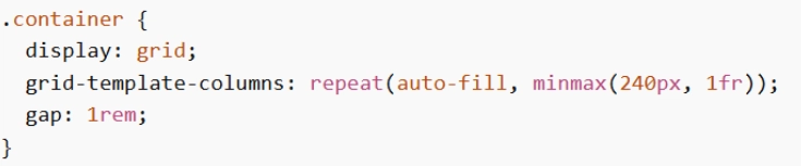
- Flexbox layouts.

| Fluid grid layouts | Flexbox layouts |
|---|---|
| Apply properties like grid-template-columns and grid-template-rows to build flexible structures that adapt to varying screen sizes. | Provide fine-grained control over element positioning, order, and sizing within a container. |
| Elements automatically resize and adjust as the viewport changes. | Properties such as flex-grow, flex-shrink, and flex-basis determine how items share space and respond to different screen dimensions. |
| Simple to set up, they provide a solid foundation for basic responsiveness across a site’s overall structure. | Well-suited for creating more advanced, responsive layouts with complex alignment needs. |
Media queries
Media queries allow you to apply styles based on the characteristics of a user’s device or the environment in which a webpage is viewed. By defining multiple queries at different breakpoints, you can tailor your design to various screen sizes and conditions.
Practical uses include:
- Hiding or showing elements depending on the viewing environment
- Adjusting font sizes across different devices
- Targeting specific screen widths below or above a breakpoint
- Styling navigation menus to adapt to screen size
Common media features:
- Orientation: portrait or landscape mode
- Resolution: minimum and maximum screen resolution
- Screen width: minimum and maximum viewport width
- Screen height: minimum and maximum viewport height
Example: This code uses a media query to hide an element. The @media rule specifies a maximum width of 500px, so the element will be hidden on screens that are 500px wide or smaller.

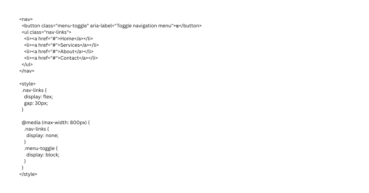
Responsive navigation
While desktop menus may include complex structures, they are often simplified for smaller screens using patterns like hamburger menus, accordions, or tabbed navigation to improve readability and usability.
The menu itself is typically built with unordered lists (<ul>) containing list items (<li>), where each item represents a navigation link. From there, media queries define how the navigation should change at different breakpoints, using properties such as min-width and max-width to target specific screen sizes and deliver an optimized experience across devices.
Responsive images and video
One of the simplest and most effective techniques for ensuring images and videos are responsive is using the max-width property. This limits the element’s width so it never exceeds its container, regardless of its original dimensions. If the media is larger than the container, max-width automatically scales it down to fit.
When paired with height: auto, the aspect ratio is preserved, preventing distortion and overflow that could disrupt the layout. This approach also improves performance, since scaled-down images often load faster due to reduced file size.
Setting max-width: 100% ensures that images always stay within the container’s width, while height: auto keeps proportions consistent as they resize.
For more control, media queries can define different max-width values at various breakpoints, allowing images and videos to adapt seamlessly across devices. Responsive video players further enhance usability by maintaining aspect ratios and adjusting playback dimensions to fit the screen.

Responsive text
To make fonts adjust across different screen sizes and devices for better readability, you can use several techniques:
- Viewport units (vw, vh): Scale text relative to the width or height of the viewport, allowing it to grow or shrink dynamically.
- Media queries: Define specific font sizes at different breakpoints, tailoring typography for mobile, tablet, and desktop displays.
- CSS clamp() function: Create fluid typography by setting a minimum, preferred, and maximum font size. This ensures text remains legible across all screen sizes while scaling smoothly with the viewport.

In the example below, the clamp() function is used to create a responsive font size for the <h1> element. The text will scale with the viewport, aiming for 15% of its width, while staying within the defined limits of 2rem at the smallest and 4rem at the largest.
Core responsive web design principles
Creating websites that adapt to any device requires understanding the core responsive web design principles. These guidelines help ensure layouts, images, and content remain functional and visually appealing everywhere
Adopt a mobile-first content hierarchy
Start by designing for the smallest screens, where space is limited and clarity is essential. Prioritize the most important content at the top, simplify navigation, and ensure that key actions are easy to access. As the screen size increases, progressively enhance the layout with additional features, visuals, and secondary content. This approach ensures mobile users, often the majority, get the best possible experience without sacrificing usability on larger devices.
Use relative units (em, %, rem, vw, vh)
Avoid rigid pixel values and instead use relative units that scale naturally across devices
- % → relative to parent size
- em / rem → based on font size
- vw / vh → based on viewport width/height
This flexibility allows text, spacing, and containers to resize proportionally, maintaining balance and readability whether viewed on a phone, tablet, or desktop monitor.
Avoid fixed heights
Fixed heights (e.g. height: 500px) can cause content to overflow or break layouts when text wraps differently on smaller screens. Instead, let containers expand naturally with their content. Use padding and margins to create spacing rather than locking elements to a specific height. This ensures that your design remains fluid and accessible, even when users adjust font sizes or view content in different orientations.
Test on real devices & emulators
Testing ensures your design works in real-world conditions. Use emulators like Chrome DevTools to preview layouts across a range of screen sizes, but also test on actual devices to catch real‑world issues like touch responsiveness, font rendering, and performance.
Compliance and accessibility
A truly responsive website building websites that are inclusive, secure, and legally compliant
As digital experiences expand across devices, aligning with global standards ensures both usability and trust.
- General Data Protection Regulation (GDPR): Responsive sites should handle personal data responsibly, with clear consent mechanisms and privacy-friendly design patterns. For example, cookie banners and consent forms must remain usable and visible across all screen sizes.
- Web Content Accessibility Guidelines (WCAG 2.1): Text should be legible, color contrast sufficient, and interactive elements usable with assistive technologies
- EU Web Accessibility Directive: Public sector websites and apps in the EU are legally required to meet accessibility standards. Hence, responsive design plays a critical role here, ensuring that content is perceivable, operable, and understandable across devices.
Optimize performance (lazy loading & compression)
Responsiveness isn’t only about layout, it’s also about speed. WordPress performance optimization is critical, especially on mobile networks.
- Compression: Reduce file sizes (images, CSS, JavaScript)
- Lazy loading: Load images/videos only when they enter the viewport
- Code optimization: Minimize unused code and requests
- Plugin conflict: Overlapping features or outdated plugins with compatibility issues can cause broken layout, slow loading or break responsive behavior
This improves page speed, reduces bandwidth usage, and enhances user experience, especially on mobile networks.
Keep touch targets large
On mobile devices, users interact with their fingers rather than a mouse cursor, so touch accuracy is naturally less precise. Because of this, buttons, links, and other interactive elements should be large enough and easy to tap.
- Follow a minimum recommended size of ~44 × 44 pixels for touch targets
- Provide enough spacing between elements
- Make important actions (CTA buttons) larger and more prominent
- Avoid placing clickable elements too close together
Want to avoid missed clicks and user frustration? Schedule a consultation with us to make your mobile interface more intuitive
Common mistakes in web responsive design principles
Even the most well-intentioned responsive designs can fall short when key principles are overlooked. Understanding these pitfalls is the first step toward building websites that truly deliver seamless experiences across all devices.
Hiding content
Some designers attempt to simplify mobile layouts by removing or hiding content altogether. While this may seem like a quick fix, it often leaves users without access to important information. Responsive design should deliver the same depth of content, functionality, and overall experience across all devices. Instead of cutting content, layouts should be restructured and prioritized so information remains accessible, readable, and easy to navigate on smaller screens
Designing for devices, not screens
Another pitfall is designing specifically for popular devices rather than focusing on flexible screen sizes. This approach quickly becomes outdated as new devices enter the market, leading to broken layouts and poor compatibility. Responsive design works best when it is fluid and adaptable, allowing content to adjust naturally to any screen size instead of targeting fixed device specifications.
Ignoring mobile gestures
Responsive design isn’t just about resizing elements, it also involves adapting to how users interact with devices. Overlooking mobile gestures such as swiping, pinching, or tapping can make navigation feel clunky and unintuitive. A truly responsive site embraces these natural interactions to create a seamless user experience.
Key takeaways to elevate your responsive web design strategy
Responsive web design principles are the backbone of creating digital experiences that adapt seamlessly across devices. By applying fluid grids, flexible images, media queries, responsive text and navigation, you can ensure your website remains consistent, accessible, and built for long‑term value. Auditing your current site and experimenting with modern CSS techniques is a great first step toward future‑ready design.
Looking for expert guidance to bring these principles to life? Sunbytes’ experienced dedicated development team can help you design, modernize, and scale responsive solutions that keep your digital presence strong and user-friendly.
About Sunbytes
Headquartered in the Netherlands with a delivery hub in Vietnam, Sunbytes has been partnered with global teams to deliver Digital Transformation Solutions for over 15 years. With senior engineering talents, we design, build, and modernize digital products that are resilient, scalable, and built for lasting value.
What sets our approach apart is the way we integrate two powerful enablers into every transformation journey:
- Cybersecurity Solutions: Our Secure by Design philosophy ensures that modernization doesn’t introduce fragility. By embedding security early and aligning it with real architectures and delivery constraints, we help teams strengthen systems with practical, sustainable improvements.
- Accelerate Workforce Solutions: Transformation at scale demands the right skills at the right time. We provide flexible capacity and specialized expertise, enabling organizations to keep roadmaps on track and delivery models resilient as demands evolve.
FAQs
There’s no fixed number when applying responsive web design principles. Common breakpoints are for mobile (≤480px), tablet (768px), and desktop (≥1024px), but the best practice is to design based on content needs, not just device categories.
You can test responsiveness by resizing your browser window, using browser developer tools to simulate different devices, checking on real smartphones and tablets, verifying that layouts, images, and touch targets adapt correctly, and using online tools like Google Mobile-Friendly Test or Responsinator.
Tools that help include:
- Browser Developer Tools (Chrome DevTools, Firefox Responsive Design Mode) for simulating different screen sizes
- Online testing platforms like Google Mobile-Friendly Test, Responsinator, BrowserStack, or LambdaTest
- CSS frameworks such as Bootstrap, Tailwind CSS, or Foundation for prebuilt responsive grids and components
- Image optimization tools to serve appropriately sized images on different devices
These tools make it easier to design, test, and optimize responsive websites.
Mobile-first design starts by designing a website for small screens and then progressively enhances it for larger devices, ensuring mobile users get the best experience. Responsive design, on the other hand, focuses on making a website’s layout flexible so it adapts smoothly to any screen size using techniques like fluid grids and media queries.
A well-implemented responsive website ensures fast loading times, smooth interactivity, and stable layout across all devices with key metrics measured by Google Core Web Vitals like Largest Contentful Paint (LCP), First Input Delay (FID), and Cumulative Layout Shift (CLS). Since Google prioritizes mobile-friendly and user-friendly sites, responsive design improves SEO by reducing bounce rates, increasing engagement, and ensuring that search engines can crawl and index the site efficiently.
Let’s start with Sunbytes!
Let us know your requirements for the team and we will contact you right away.


